
_gif.gif)
A new identity mark
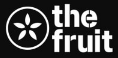
I began by designing a mark that felt both iconic and organic, reflecting the institution’s long-standing roots in Durham and its artistic identity.
The final icon draws inspiration from three sources: an apple (a nod to their original logo), a dancer (honoring their reputation as the “Best Place to Dance”), and the letter F — a subtle reference to the organization’s name.
Bringing a 100-year warehouse to the present through branding.
ROLE: CREATIVE DIRECTION
.png)
Insight
People visit the Fruit for the first time because their favorite band, DJ , artist, or personality is there. This caps the Fruit’s revenue as to what is cost-shared by event producers and left its brand to the whim of whatever is being hosted that day.
Idea
A rebrand that positions the Fruit as a curator of great art.
Old Logo
Old Website

Team
Creative Direction: Mistyre Bonds
Developer: Yuki Okida
Photographer: Chrystal Kelly
Rebranding
The transforming arts warehouse
With custom content and graphics to match
From there, I expanded the system into a series of supporting lockups, visuals, and content — all designed to express one clear message: The Fruit is a place where you can be entirely yourself, no matter how different you are.


Making it real with a website
Finally, I reimagined their website — translating the personality of their 100-year-old building into a digital space that feels just as weird and character-filled online as it does in person.
