
A brand for a consulting firm designed to look less like the industry and more like their community.
ROLE: CREATIVE DIRECTOR
Insight
Consulting firms have a look
It’s blue, because “community.”
A lot of white space, because “corporate.”
And sans serifs, because “serious, big-boy business.”
Idea
This Black woman–owned consulting firm wanted branding that reflected both who they are and the community they serve. After several rounds of interviews, we landed on three words to guide their branding: lively, energetic, and community-centric.
Examples of other consulting pages


Team
Creative Direction: Mistyre Bonds
Developer: Yuki Okida
Writer: Kira Taylor
Junior Designers:Cameron U.
UX + Branding design
Putting the community in consulting
A new digital home
A website that led with their mission and effectiveness — and ultimately broke the grid.


About page mockup

Focus Areas page mockup

Meet the Team page mockup

A new digital home
Blog page mockup
Bringing it to life via social templates
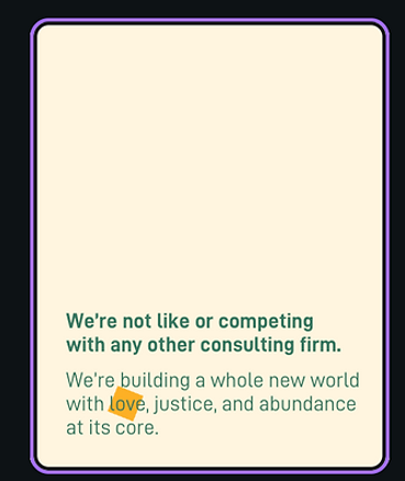
From there, we developed a set of brand guidelines and brought them to life through social media templates — one for each of their key audiences: companies with DEI values seeking a consulting partner, and Black women who don’t yet know they have the chops to become fundraising consultants.
For both, we used real language from their audience to strike a tone that’s unapologetically authentic yet deeply supportive.

Example content for prospective consultants
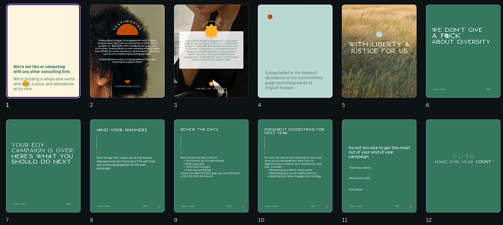
Example content for prospective clients